Dynamic charts in LibreOffice Calc
Sometimes you want to visualize data in LibreOffice Calc, which you only get time by time. In the meantime, however, you want to view the existing data in a diagram and want to add the future data later. You want LibreOffice to add them automatically in the existing chart without having to change the data range each time. LibreOffice is unfortunately not able to do this without also displaying empty entries. This workaround lets the diagram grow semi-automatically with the data.
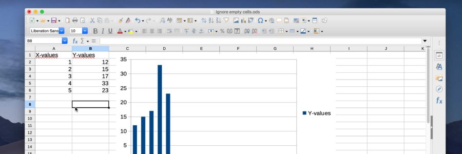
If you select a data range in LibreOffice to create a chart, which is larger than the existing data, including empty cells, then these empty cells are also displayed in the chart. This usually results in a large empty area on the right-hand side of the data, which nobody wants.
Unfortunately LibreOffice, even compared to Google Tables, is not able to hide empty entries and add new ones to the chart automatically. With a workaround you can at least avoid yourself the constant changing of the data area.
- Mark all cells with data but add the ones which will contain data in the future, too. E.g. you have data in 2 rows 5 lines already. But you expect 30 lines. So you mark the two rows down to line 30 or 31 when you have a header line.
- Insert a chart over these selection.
- Now you see you chart with your existing values but also the empty ones. Mark the selection as done in 1. again (IMPORTANT) and then add the Autofilter (Menu: Data-Autofilter)
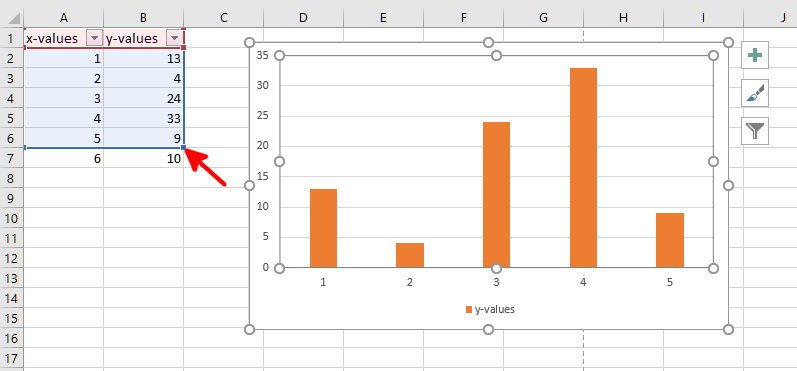
- Click on the down-arrow/triangle button of the Autofilter and click on “Not empty”. Than you see that empty entries are gone from the chart. But the empty cells in the table are also gone or better hidden. But now you have what you wanted
- But to add additional values in the table you have to make them visable again. Click on the down-arrow/triangle button of the Autofilter again and click 3 times on “all” till it is activated. Then all hidden lines are visable again but also in the chart. Do not bother.
- Add values to your table.
- Then use the previous procedure of point 5 again. You get the chart without the empty entries but with the new values.
- And so on.
This workaround is not perfect, like all workarounds, but does the job and saves hazel and time.
And how does this work in Microsoft Excel?
In Excel® 365 you simply add more values, then click on the chart. A red frame (table header) and a blue frame (values) with “handles” appear around the old data. Click and hold the blue frame’s handle (bottom right) with the left mouse button and drag it over the new values and then release it.
For older versions you may refer Tech Republic’s article “Two ways to build dynamic charts in Excel“.
danke erstmal für die schöne anleitung.
also bei mir funktioniert es auch ohne den punkt 7 und das erneute auswählen im filter. es läuft genau so wie es sein soll, das diagramm erweitert sich um die daten, die hinzugefügt werden.
thema excel: dort gibt es formeln, die den datenbreicht erweitern. da ich excel nicht verwende, interessiert es mich nicht weiter, aber ich wollte es nicht unerwähnt lassen.
Hallo Giorgio, danke für deinen Kommentar und die ergänzenden Tipps. Die Anleitung ist 3 Jahre alt und mit der entsprechend alten LO-Version gemacht worden. Ich habe das mit der aktuellen noch nicht verursacht bzw. machen müssen.